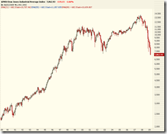
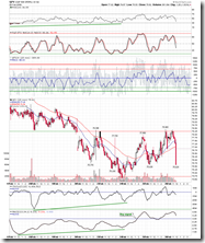
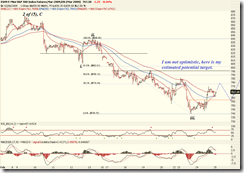
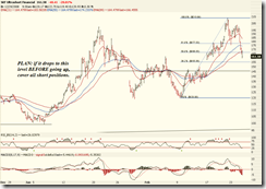
[Last weekly analysis]. The market is in a free fall which can be readily seen on the weekly chart.
Overview of World Markets and Sectors
The following weekly chart is a puzzle to me since the world market is still relatively steady while the US market is tanking hard. It is really like a one man show at the time being, especially the emerging market is in fact quite strong. From the relative strength chart, we can also see that the emerging market has a much better shape.

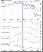

The next chart shows the MSCI World/EAFE/Emerging Market, Shanghai Stock Exchange Composite Index, Hang Seng Index, and Nikkei 225 index. It shows that emerging market is more resilient in this round of sell off. One can also check out the weekly chart of EWZ (ETF for Brazilian market), CAF (China A share fund), and FXI (Hong Kong market)
Major indices, commodities, and US dollar are shown in the next chart. What I see on the chart are: Nasdaq still looks better than other market (red hollow candle has a chance to reverse the trend). US dollar looks exhausted while the commodities are still going up, what will happen to commodities should the dollar heads down in the coming weeks. The pattern of the crude oil looks bullish although it's right at the resistance level.
Sector overview chart. In term of dropping percentage the financial sector is still the most bearish sector among all give the astonishingly high ratio of single day down. However, the sector has been calmed down in some sense although more dropping is in the sight.
SPX
In the beginning of this report we have seen the weekly chart. The monthly chart looks like a disaster -- since the bear market started there is no single month when the market has any significant amount of gain. This has surpassed any previous crisis or whatsoever downturn.
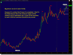
The wave counting on the daily chart is very clear and there is no doubt that wave 3 of (5) is playing out. The question is when the trend can be reversed.
On the P&F chart the trend as well as the breakout are clear, however there is no reference level at the below, it remains unclear where the target is.
There is conclusion with respect to the target level in the near term, what we can believe is that the market is not oversold yet, and the sell off intensity has no sign of weakening. Therefore bottom fishing should be highly dangerous.
XLF and SKF
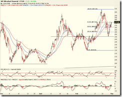
The up trend of SKF is strong, and there is not technical setup which shows any possible sign of reversal.
Currency Futures and Forex
US dollar index futures: It's right below the resistance. After so many times of attempting, this time it should have a better chance of breakout. This is very bearish to the broad market.
Euro FX futures is just the opposite of US dollar but slightly off the low.
Japanese Yen Futures: a nice breakout out of the triangle pattern, unfortunately Yen is no longer the primary player in the carry trade, and the bearish trend of Yen doesn't support the stock market in any sense.
USD/CAD daily:
Commodities
Gold: on the daily chart, the pattern looks still bullish.
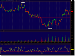
Crude oil: the monthly chart shows a biggest crash ever, one can imagine that without several months of bottoming phase, no up trend could be formed. Also there is nothing called "missing the train" because once the up trend is established, one can buy and hold for years. Daily chart looks very boring, on the contrary the hourly chart is full of violent up and down. In the very near term it looks still bullish however I believe this is just temporary.


