This is the update to the last weekly analysis.
Market overview:
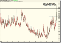
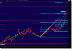
Firstly take a look at the weekly chart $VIX (CBOE Volatility Index) from 1998 to present.
Different from any other data, VIX does involve any demand/supply but only the sentiment of market players. So I do not intend to over-analyze the chart.
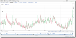
VXO is the CBOE OEX volatility index. It may not be as accurate as VIX but the data can be traced back to 1986 on Yahoo Finance.
It is no doubt that the current stock market crash can be comparable with 1987 black Monday and much severe than dot com crisis.
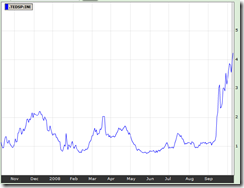
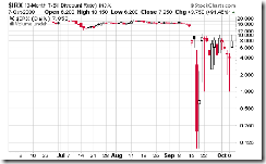
TED spread is increasing which reflects the continuous uncertainties on the credit market. Before the trend reversal is confirmed, the stock market is still like a casino.
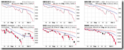
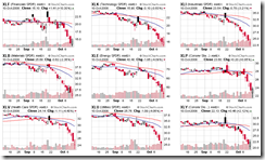
The following chart shows the MSCI World index, MSCI EAFE index, MSCI Emerging Market, Shanghai Stock Exchange Composite Index, Hang Seng Index, and Nikkei 225 index. The whole world is tanking while the emerging market recovered a bit, and mainland China market is probably the most resilient one.
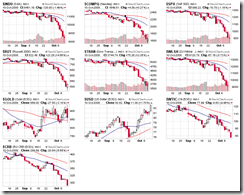
Major indices, commodities, and US dollar are shown in the following chart. I have only one word: terrible.
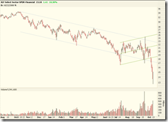
Sector overview shows that all sectors have been going down parabolically. However, the financial sector might be the first one which shows a dead cat bounce. Not because the financial sector is the most healthy one, but most of rescue fund will be spent on this sector and it will get the most attention. However, this is not a reason to open long positions on XLF/UYG.
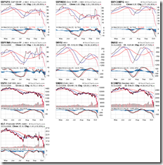
On the glance of major indices and bullish percent, there is absolutely no sign of recovery over the intermediate term. It is no doubt that the market is extremely oversold, and a strong short-term rally is possible, however the mid-term trend is still bearish.
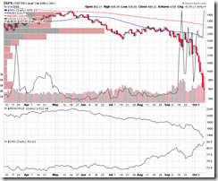
From the Credit Risk and SPX we can see that the discrepancy between LIBOR and 1-month treasury bill is at a historical level again. Although many people are looking forward a reversal, I would say it is too early.
Descending channel of Major indices:
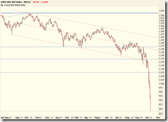
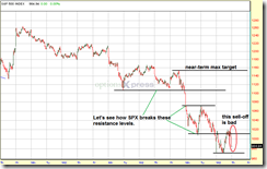
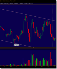
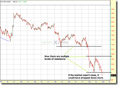
Last week the descending channel of SPX was broken at the lower edge, which meant the selling off could be accelerated. Why was I so stupid and didn't sell everything and started to short? Now it is too late.
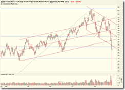
Here is XLF, note that both the ascending and descending channels were broken on Oct 6th/7th, which should a strong signal to start short, however I overlooked it.
I didn't touched QQQQ because the expensive price of QID looked scary.
Wave counting:
SPX daily:
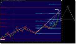
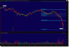
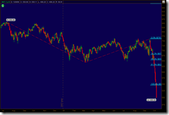
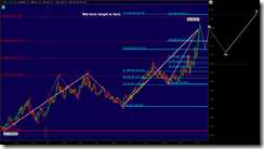
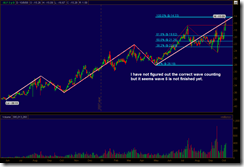
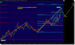
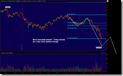
SPX is in major wave 3, and the question is if this wave is completed and then if we are going to have a mid-term rally which is major wave 4. In my opinion, the internal structure is incomplete so there should be a new low or comparable low (suppose minor wave v is an exhausted wave) in the future. Then it is logical to touch the low of the last bear market at 768.
XLF daily:
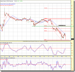
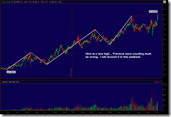
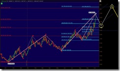
It looks like a short-term top is in place, then the next question is if it will reach the July level (red/blue horizontal line). Because of the incomplete internal structure, I think there will be a new low in the future.
Here is a daily chart of SKF:
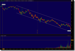
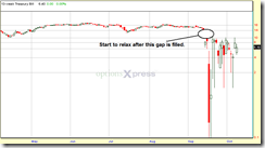
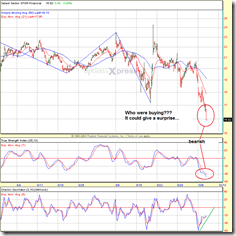
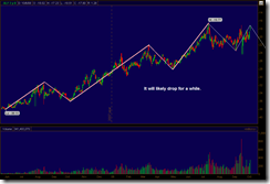
Will it go further up? It seems unlikely in the near term, but who knows the long term? I still cannot get it right, SKF is too violent and unpredictable. Compare with SKF, UYG looks much "normal" and just move in a descending channel:
QQQQ daily:
Again, the internal structure is incomplete.
Currency:
I do not touch any forex trading. After a stock market crash, I feel interesting to see how the exchange rates changed in the past week.
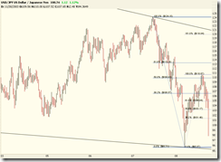
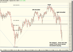
USD/JPY:
The exchange rate between US dollar and Japanese Yen dived down just like how the stock market crashed in the last week. No wonder Nikkei 225 index went down even faster than S&P 500. Here is the daily chart:
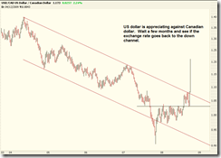
USD/CAD:
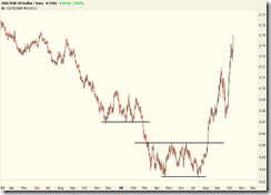
USD/EUR:
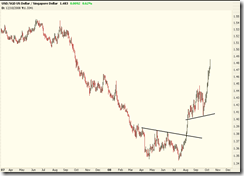
USD/SGD:
Commodities:
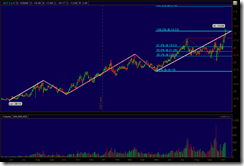
Gold (continuous adjusted):
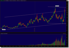
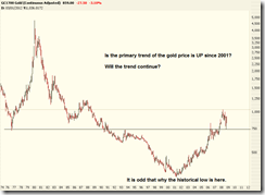
Here is the monthly chart of gold price since 1974. It seems the gold is in a multiple-year bull market, isn't it?
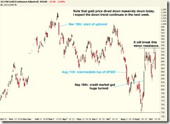
Look at the daily chart:
Note that today the gold price dropped significantly (you can also see this on the GLD chart). Someone said this is because some big funds got margin calls and then sold off their gold holding to cover the stock losses. I don't know, but does this big candle imply anything? I doubt, check the comments on the chart for more information.
Crude oil (continuous adjusted)
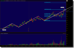
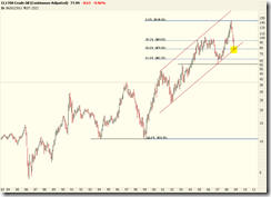
The following chart shows the adjusted crude oil price since 1983.
Note that the current price level is at an interesting point:
- Fibonacci 50% measured from 1999 low to the history high;
- Lower edge of the ascending channel.
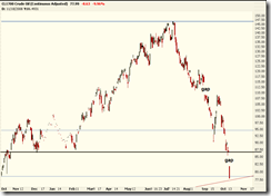
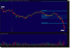
The drop of the oil is by no means the sign of economy recovery, in my opinion. Anyway, keep an eye on it and see how the trend develops. Look at the daily chart:
I suspect the down trend will continue. On the chart of USO, the last candle is a white candle. I think it's inaccurate compare with the futures' data. Big players will always use CL or QM to trade or hedge their holdings. ETF must have a tracking error.
Last comments:
Today's rally is not because the selling strength is over or everyone want to catch the bottom. In my opinion, it is probably because of the G7 meeting in the weekend and bears don't want to have any surprise so they had to lock a part of the profit. Another reason might be that the P/E ratio of the broad market might reach a certain value and the computer programs of big funds started to buy some discounted stocks automatically. Nobody knows, but certainly it is not a guaranteed bottom. If the G7 meeting does not come up some really great news, the down trend may be resumed very soon. Keep an eye on index futures, currencies, and Asian markets from the Sunday afternoon.
Last thing, before the smoke is cleared the capital preservation is the number one priority.
