Here is the candle glance of this sector vs SP500 index:
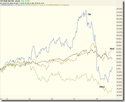
Comparing with the broad market, it seems they are doing pretty well. We are focusing on PKG, SSCC, and TIN. Now let's look at how they performed during the past 5 years:
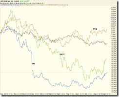
... and during the past one year:
From the following two charts, it can be seen that:
- TIN has the greatest volatility;
- PKG usually goes with the broad market;
- SSCC is between TIN and PKG. Over the past few years, SSCC underperformed and now it is bouncing back.
Now let's check these three stocks one by one.
TIN:
10 year weekly chart:
It performed very well in the past few years but since 2007 it has been going down until recently it is recovering from the historical low? Because the price drop happened before drop of the broad market, it is prudent to understand why.
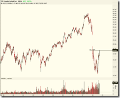
Daily chart:
Over the near term it is oversold. Now it is right at the resistance. Once it breaks the resistance, it may fill the runaway gap -- however there must be a reason behind the strong upside movement.
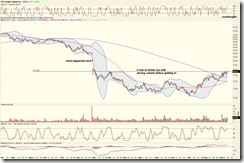
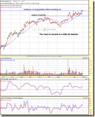
60-min chart:
The chart is neutral to a little bit bearish because the upside resistance has not been broken out yet. After the potential breakout, it should be a good trade to open long position and set stop below the resistance level.
Daily chart with VPCI:
The volume-price moderately confirms the bullish trend. Again, we have to see the breakout first.
SSCC:
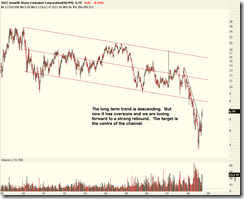
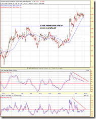
10 year weekly chart:
This stock has spent its life on moving in a descending channel. Since the middle of 2007, it dropped much quickly than before and now it is recovering. Hopefully the rebound can touch the lower edge of the channel, which will be a hefty profit!
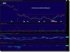
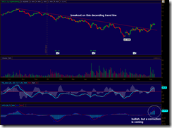
Daily chart:
It is overbought in the near term (sorry for the mistake on the chart). However the breakout from the year long downward trend line is still valid, and I hope it can go up again after a correction.
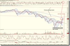
60-min chart:
The TSI and Chaikin oscillator have an obvious negative divergence with the price movement. Most likely it will go down from the current level and retest the previous resistance level.
Daily chart with VPCI:
Breakout is valid, and the price-volume confirms the trend. However a pullback is due.
PKG:
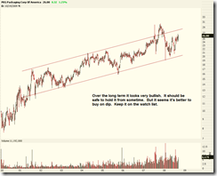
10 year weekly chart:
The chart pattern looks very bullish. Regardless of the broad market condition, it seems this stock keeps going up all the time. The question is how long the trend will last? There must be some fundamental reasons. On the other hand, the volatility is huge so it is wise to choose a good entry point.
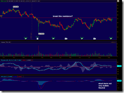
Daily chart:
The resistance ahead looks not strong enough and it will be broken quickly. In the near tern PKG is overbought and now is not the best point to open a long position.
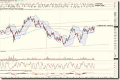
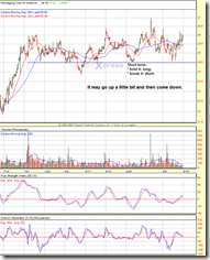
60-min chart:
The momentum is going up, and a support level is sitting at 24.5. I expect it go up a bit and then come down. Depending on whether or not it breaks the support, the trade can be long or short. Of course the short should be short-term play and is for speculation only.
Daily chart with VPCI:
The chart looks neutral, and the VPCI indicator does not confirm or invalidate the price movement. After the consolidation, a long position can be opened if the resistance is broken.
Other stocks in the sector:
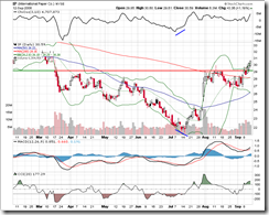
IP:
Overall trend is bullish. The second time breakout does not have a heavy volume. It will likely retest the support level.
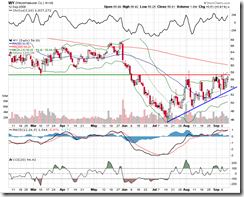
WY:
This stock looks bullish, too. However it has to break the resistance and hold the blue upward trend line.


No comments:
Post a Comment